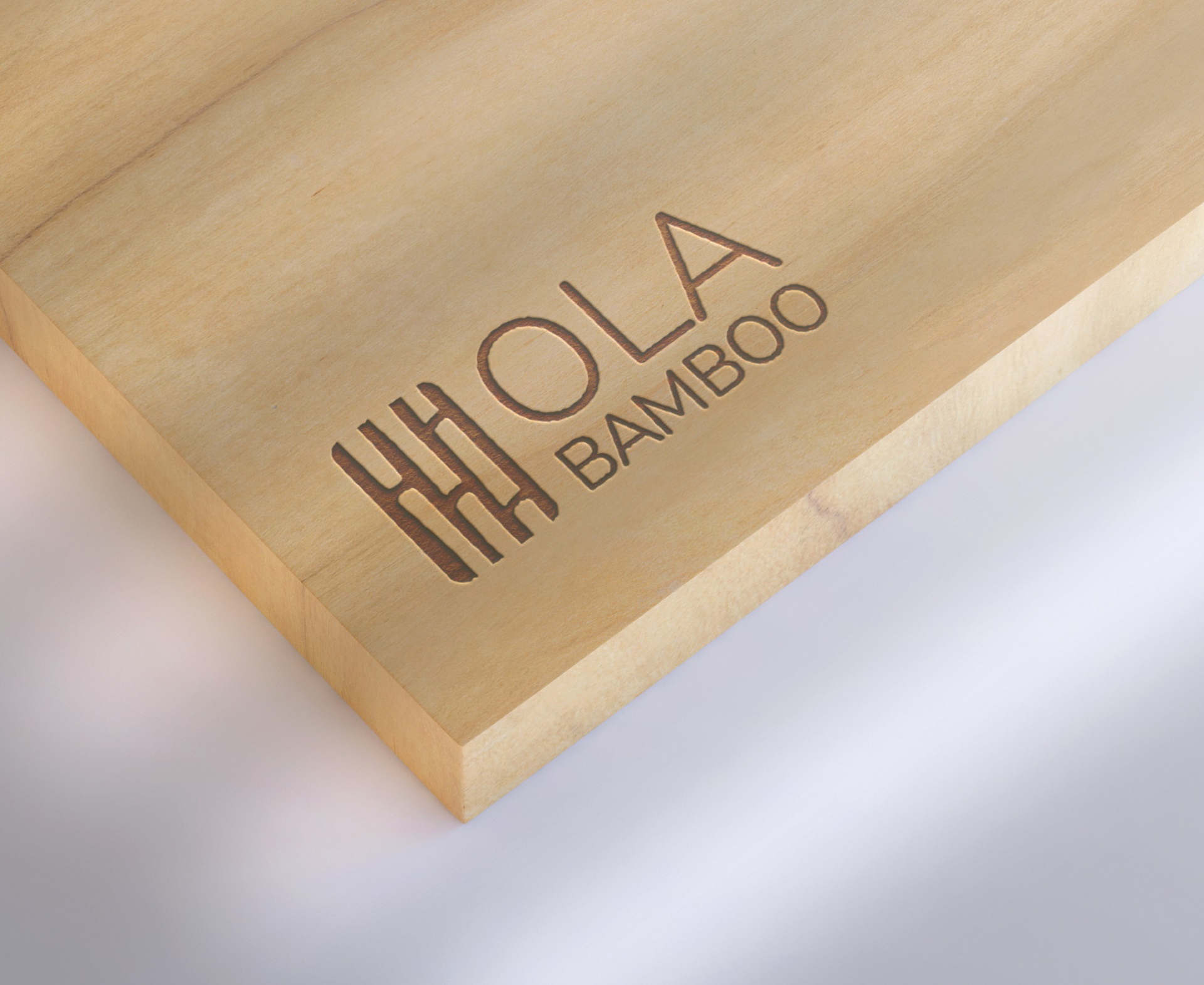
The goal of this hypothetical re-design project was to improve the OLA Bamboo logo and branding to better represent their brand values and mission. This project was apart of my Brand Identity course while studying in the Graphic Design program at St. Lawrence College.
OLA Bamboo creates environmentally friendly home and personal care products that are affordable and easy to use. Their products are primarily made from bamboo and other sustainable materials. OLA Bamboo’s mission is to reduce plastic waste by creating products without the use of plastic, to reduce the negative impacts it has on the environment.
The symbol of the re-designed logo is inspired by the company name by including imagery of bamboo stalks. The natural bamboo green, rounded corners, and organic shapes of the bamboo sections represent OLA Bamboo’s value in protecting the environment. Nunito is the typeface for the wordmark and was chosen for its clean look and rounded corners to reflect the rounded corners of the bamboo symbol. Black was chosen for the wordmark to appear fresh and clean, paired with the green. Each of these purposeful design decisions contributed to an effective logo design that improved the original OLA Bamboo logo to represent their values and mission more effectively.

